 Make a Suggestion
Ask a Question
Print
Make a Suggestion
Ask a Question
Print Assessment Comparison Report
Key to numbers
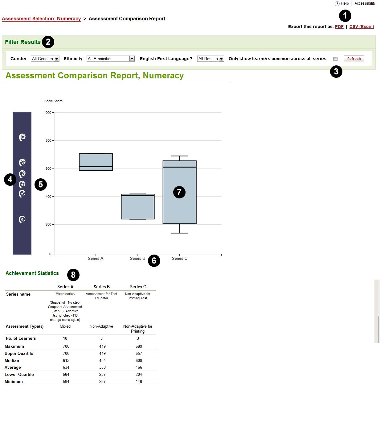
1. Export this Report. You can download and keep a record of this Report as a PDF or CSV (Excel spreadsheet) by clicking on one of these links.
2. Filter Results. You can filter the data using the dropdown lists on this bar. You can filter by Gender, Ethnicity, or by English as a first language, to show selected Groups of Learners. In this example, no filters have been used.
3. Further selection of Learners. By default, you get a Report on Learners who took part in any of the Assessments, you can also choose to get a Report only on those Learners who took part in all of the Assessments. To do so, check the Only show Learners common across all series box on the right.
4. Koru. The koru indicate the steps on the learning progressions. There are six steps, with Step 1 at the bottom of the graph and Step 6 at the top. The spacing of each Koru on the scale shows the range of achievement of students reported as performing at that step, as well as the range of difficulties of questions in the Assessment for that step in the progressions.
5. The achievement scale. The vertical axis shows a scale from 0 to 1000, indicating increasing achievement on the learning progressions. All the Assessments are linked within each strand (Numeracy, Reading, or Writing), so that the Scale Scores have the same meaning regardless of which Assessment within the strand is included in the Report.
6. The Series (Assessments or groups of Assessments). The horizontal axis shows a label for each Assessment that has been selected for the Report. One Series (for example, Series A) may represent a unique Assessment, or it may represent a number of Assessments combined into a Series. Between one and five Series may be shown on one Assessment Comparison Report. This example shows three (Series A, B and C).
7. Box and whisker plot. This shows the distribution of Learners' results for each Series.
- The 'box' in the middle represents the spread of the middle 50% of the Assessment results, with the median shown by the horizontal line across the box.
- The 'whiskers' (the T-bars above and below the box) show the top 25% and bottom 25% of the Assessment results. For the whisker above the box, the vertical line represents the spread of the top 25% of the Learners' results, while the horizontal line at the top represents the very top result in the Assessment. The whisker below the box shows the lower 25% of the Assessment results in a similar way.
8. Achievement statistics. This table provides more detail about the spread of Learners' results at for each Series.
The labels at the top identify the Assessments or Series (in this example, Series A, B and C).
- The next three rows provides the name of the Assessment or Series, the Assessments referred to, the type of Assessment and the number of students reported in this Comparison Report. If different types of Assessments have been combined in a Series, the Assessment type is shown as Mixed.
- The Minimum, Lower Quartile, Median, Upper Quartile and Maximum give values in scale score points in relation to the ranking of Learner results from bottom to top.
- Minimum the lowest result achieved by a Learner in the Assessment for this Series
- Lower Quartile the scale score below which one quarter (25%) of the results of the Assessment lie
- Median the scale score below which half (50%) of the results of the Assessment lie
- Upper Quartile the scale score below which three quarters (75%) of the results of the Assessment lie
- Maximum the highest result achieved by a Learner for this Series.
- The Average is the mean result (the total of all the Learners' results divided by the number of Learners).
Make a Suggestion
Ask a Question
Print | Last reviewed:
20/01/2011 2:21:38 p.m. © Tertiary Education Commission. All rights reserved. |